

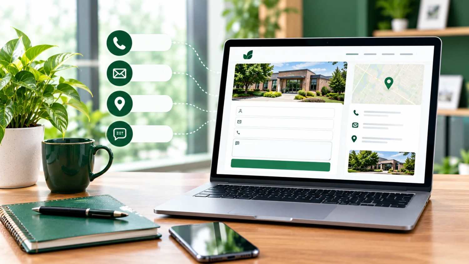
Contact page design best practices come down to six things: (1) a form with only 3–5 fields, (2) your phone, email, address, and hours visible without scrolling, (3) one clear call-to-action button, (4) a mobile-friendly, single-column layout, (5) trust signals such as a response-time promise and a real team photo, and (6) a link to the page from your header, footer, and key pages. Test the page on a phone, then track form submissions and calls.
Contact Page Design Best Practices: Why This Page Decides Whether You Get the Lead
A visitor who opens your contact page is ready to act. If the form is long, the phone number is buried, or the page breaks on a phone, they leave and call a competitor. A well-built contact page is often the shortest path from interest to revenue on your whole site.
The best contact page designs share the same core: a short form, visible contact details, one clear call to action, and a layout that works on mobile. The sections below show how to build each part and how to measure results.
If you want a team to build this for you, our professional Website Design services in Central Ohio include contact pages designed for conversions. Richwood Marketing services are available exclusively to Richwood Bank business customers.
What Is an Effective Contact Page Design? The Essential Elements
An effective contact page design includes these elements:
- Business contact information: phone, email, physical address, and business hours.
- A website contact form: short, labeled clearly, with one submit button.
- A clear call to action: a button such as “Get My Free Quote” instead of a vague “Submit.”
- Trust signals: a response-time promise, a team photo, reviews, or a privacy note.
- Map or directions: essential for local businesses.
- Alternative customer contact options: click-to-call, email, or chat.
Think of the page as a front desk. Visitors should immediately see who you are, where you are, and how to talk to you.
How to Design a Contact Page: Step-by-Step
- Define the goal. Do you want calls, quote requests, or bookings? Design around one primary goal.
- Put the main action above the fold. The form or the phone number should appear without scrolling.
- Write a human headline. “Tell us about your project. We reply within one business day” beats a bare “Contact.”
- Add every channel your customers use. Phone, email, form, and address, each with a clear label.
- Add proof. A real photo of your team and a short line such as “Locally owned since 2014” build trust.
- Link to it everywhere. Put it in the header, footer, service pages, and blog posts.
- Test, launch, and track. Submit the form yourself on both desktop and mobile.
Contact Form Design Best Practices: Fields, Labels, and Buttons
Most lost leads are lost at the form. Follow these contact form design best practices:
| Element | Best practice | Why it works |
| Number of fields | 3–5 (name, email, phone optional, message) | Fewer fields reduce effort and abandonment |
| Layout | Single column | Easier to scan, especially on mobile |
| Labels | Visible above each field | Placeholder-only labels disappear when typing |
| Required fields | Mark clearly, require only what you need | Avoids surprise errors |
| Button text | Action-oriented (“Request My Quote”) | Sets expectations better than “Submit” |
| Errors | Inline, specific messages | Visitors fix mistakes without retyping |
| Spam protection | Invisible reCAPTCHA or honeypot | Blocks bots without frustrating people |
| Confirmation | Thank-you message with next steps | Reassures the visitor and reduces repeat submissions |
A widely cited case study reported that cutting a form from 11 fields to 4 raised conversions by about 120%. Exact results vary, but the direction is consistent: every extra field costs you leads. For the technical side, Google’s Learn Forms course on web.dev covers accessibility, validation, and autofill in depth.
How to Create a User-Friendly Contact Page for Mobile
Most local searches happen on phones, so a mobile-friendly contact form is essential. Use these checks:
- Tap-to-call phone number and tap-to-open map links.
- Large tap targets: buttons and fields at least 44px tall.
- Correct keyboards: use email and telephone input types so the right keyboard appears.
- Autofill enabled so visitors do not retype their name and email.
- Fast loading: Google research has found that 53% of mobile visits are abandoned when a page takes longer than 3 seconds to load. See our guides on how website speed impacts conversions and page speed optimization.
Contact Page Optimization: How to Increase Your Contact Form Conversion Rate
Contact page optimization is an ongoing process. These changes usually move the needle most:
- Reduce form abandonment: remove optional fields, add inline validation, and keep the form visible without a click.
- Strengthen the clear call to action: use a high-contrast button with benefit-driven text.
- Promise a response time: research published in Harvard Business Review found that companies replying to leads within an hour were about seven times more likely to qualify them. State your timeframe, then keep it.
- Lower the risk: add “No obligation” or “Free consultation” near the button.
- Track the right numbers: form submissions, click-to-call taps, and conversion rate.
Which Customer Contact Options Should a Business Contact Page Include? (Comparison and Decision Guide)
| Contact option | Best for | Speed | Effort for visitor | Include it if… |
| Contact form | Quotes, detailed requests | Medium | Medium | You need project details |
| Phone (click-to-call) | Urgent or high-value leads | Fast | Low | You can answer or return calls quickly |
| Email address | Formal or document-based inquiries | Slow | Medium | Customers send files |
| Live chat | Quick questions | Fast | Low | You can staff it |
| Booking calendar | Consultations | Fast | Low | You sell appointments |
| Map and address | Local, walk-in businesses | n/a | Low | Customers visit you |
Decision guide:
- Local service business? Phone, map, and a short form.
- High-ticket or custom work? Form with a “project details” field, plus a booking calendar.
- Small team that can’t answer instantly? Form and email only. Skip chat.
- Not sure? Start with form, phone, and address. Add others after you see how customers behave.
Contact Page Mistakes That Cost You Leads
- Hiding the contact page in the footer only
- Asking for a budget, company size, and address on a first contact
- Using “Submit” as the button text
- Skipping a confirmation message
- Forgetting to test mobile and spam filters (a form that sends to a dead inbox loses every lead)
- Letting the page load slowly with heavy images or maps
What Does This Look Like in Practice? Our Experience
At Richwood Marketing, we have helped more than 400 Central Ohio businesses and designed and managed around 180 websites since 2014. The contact page problems we see most often are long forms, buried phone numbers, and forms that never reached the owner’s inbox. Fixing those basics, before any redesign, tends to produce the quickest gains.
If you want to see how our full service mix works together, learn more about our marketing services. A strong contact page also supports your local visibility, so pair it with local SEO and consistent business contact information across directories.
Our Recommendation
For most small businesses: use a 4-field form (name, email, phone, message), a visible click-to-call phone number, your address with a map, and one action button. Add a response-time promise. Track submissions and calls monthly and adjust.
Contact Page Best Practices Checklist
- 3–5 form fields, single column
- Phone, email, address, and hours visible
- Action-oriented button text
- Mobile-friendly, tap-to-call
- Thank-you message and email notification tested
- Page loads in under 3 seconds
- Linked from header, footer, and service pages
- Conversion tracking active
Frequently Asked Questions About Contact Page Design
What should a contact page include?
A contact page should include a short contact form, phone number, email address, physical address, business hours, a clear call-to-action button, and a trust element such as a response-time promise.
How many fields should a contact form have?
Aim for 3 to 5 fields. Name, email, and message are usually enough, with phone optional. Ask for more details after the first conversation.
How do I design a contact page that converts?
Put the form and phone number above the fold, use a benefit-driven button, keep the form short, add trust signals, and make the page fast and mobile-friendly.
Where should the contact page go on a website?
Put it in the main navigation (as “Contact” or “Contact Us”) and repeat the link in the footer and on service pages.
How can I reduce contact form abandonment?
Remove unnecessary fields, show inline error messages, enable autofill, and add a reassurance line such as “We reply within one business day.”
Should I use a contact form or just an email address?
Use both. A form is easier on mobile and gives you structured information, while an email address suits visitors who want to attach files.
How do I make a contact form mobile-friendly?
Use a single column, large tap targets, the correct keyboard types, and autofill, and keep the page fast.
How do I know if my contact page is working?
Track form submissions, phone-tap clicks, and the contact-page conversion rate. Compare these monthly and run small tests.
Conclusion: Make Your Contact Page Easy to Use
Strong contact page design best practices make it simple for customers to act: a short form, visible contact details, a clear call to action, and a mobile-friendly layout. Review your own page against the checklist above, fix the biggest gap first, and measure the result.
Ready to turn more website visitors into calls and leads? If you are a Richwood Bank business customer, get in touch with our team for a free consultation.
